Rebrand for The Corp
Students of Georgetown, Inc. (The Corp) is the largest student-run non-profit organization in the world. Its subsidiary companies currently consist of coffee shops, grocery stores, and an organic cafe. At its core, however, The Corp is a form of protest centered around community care. Founded in 1971 to empower students after Georgetown University administrators authorized the tear-gassing of student protesters, The Corp embodies togetherness, self-sufficiency, and mutual aid. The organization’s current branding is steeped in tradition but relies solely on text. It does not express the crucial values that define The Corp.
The organization’s rebrand symbolizes unity and collaboration. Blue and orange are complementary colors, or artistically opposed, but are expressed in softer tones that both pop and meld together.
These colors highlight The Corp as a hub for diverse leaders who complement one another in the interest of common goals and shared space.
The Corp’s new logo features two interlocking hands in the shape of a heart. These hands support one another and are situated in between the logo’s text -- beneath “The Corp” and above “Since 1971.” As such, the friendship and teamwork of The Corp are the centerpieces for the company itself.
The year of 2020 was an urgent reminder that corporations must leave a positive impact on their communities. The Corp’s new branding takes this duty into account and expresses it clearly to consumers. This design highlights The Corp for what it is: impactful, constructive, and supportive.
Campaign inspired by “Reputation as a Pillar of Corporate Transformation” by Cleber Martins, Partner and Managing Director of LLORENTE & CUENCA.
Logo Design
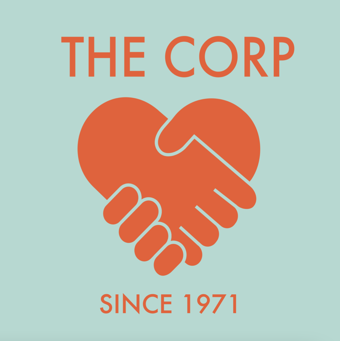
New logo
Former logo
Logo Design Process
Initial Logo 1

Initial Logo 2
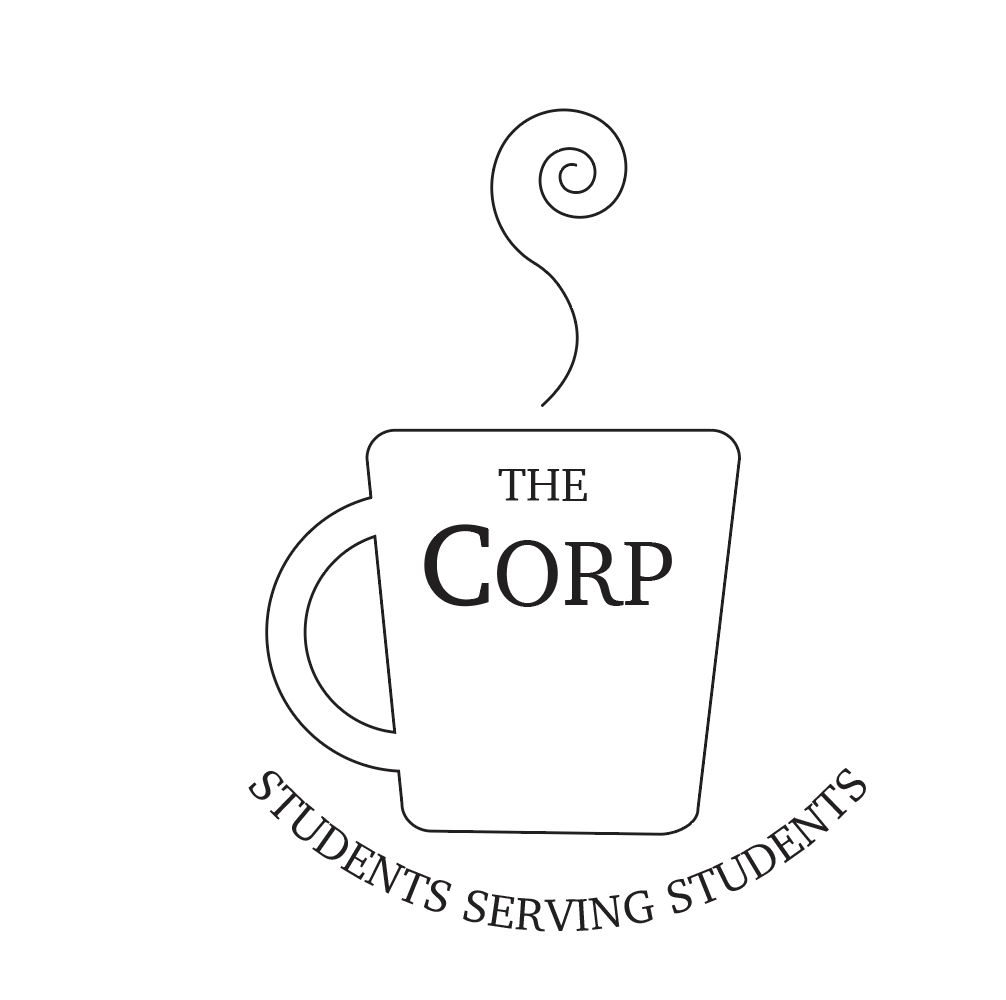
Initial Logo 3

Refined Logo
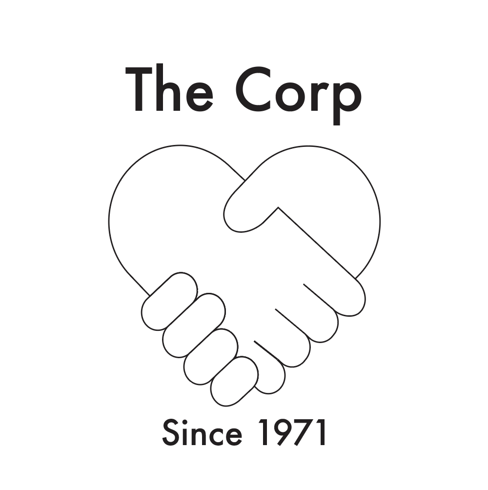
Type Study 1
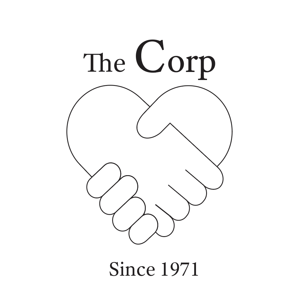
Type Study 2
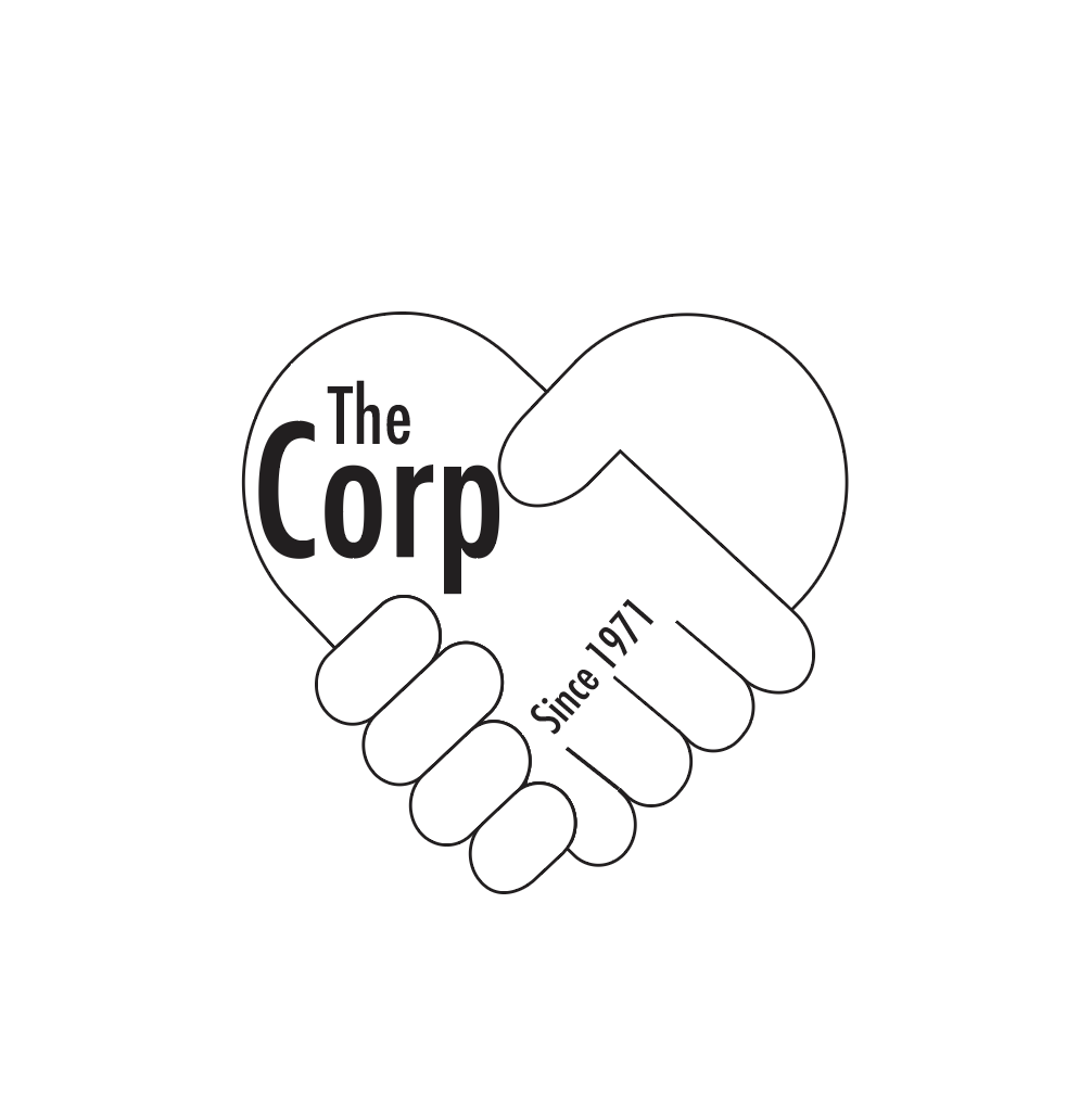
Type Study 3
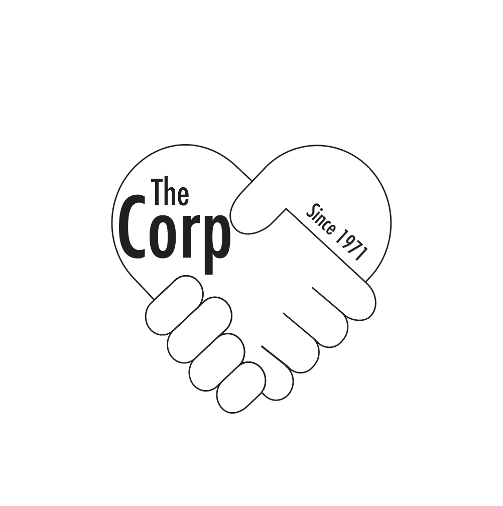
Type Study 4
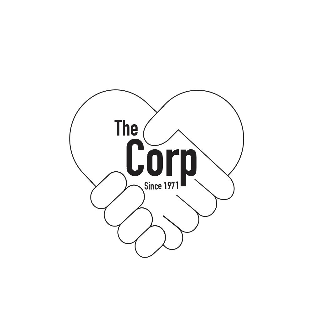
Type Study 5
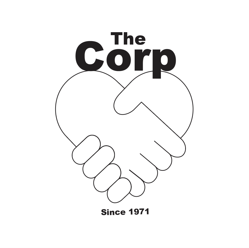
Type Study 6
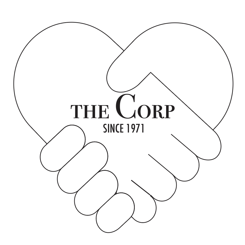
Type Study 7
Type Study 8
Type Study 9
Type Study 10

Type Study 11

Type Study 12
Type Study 13
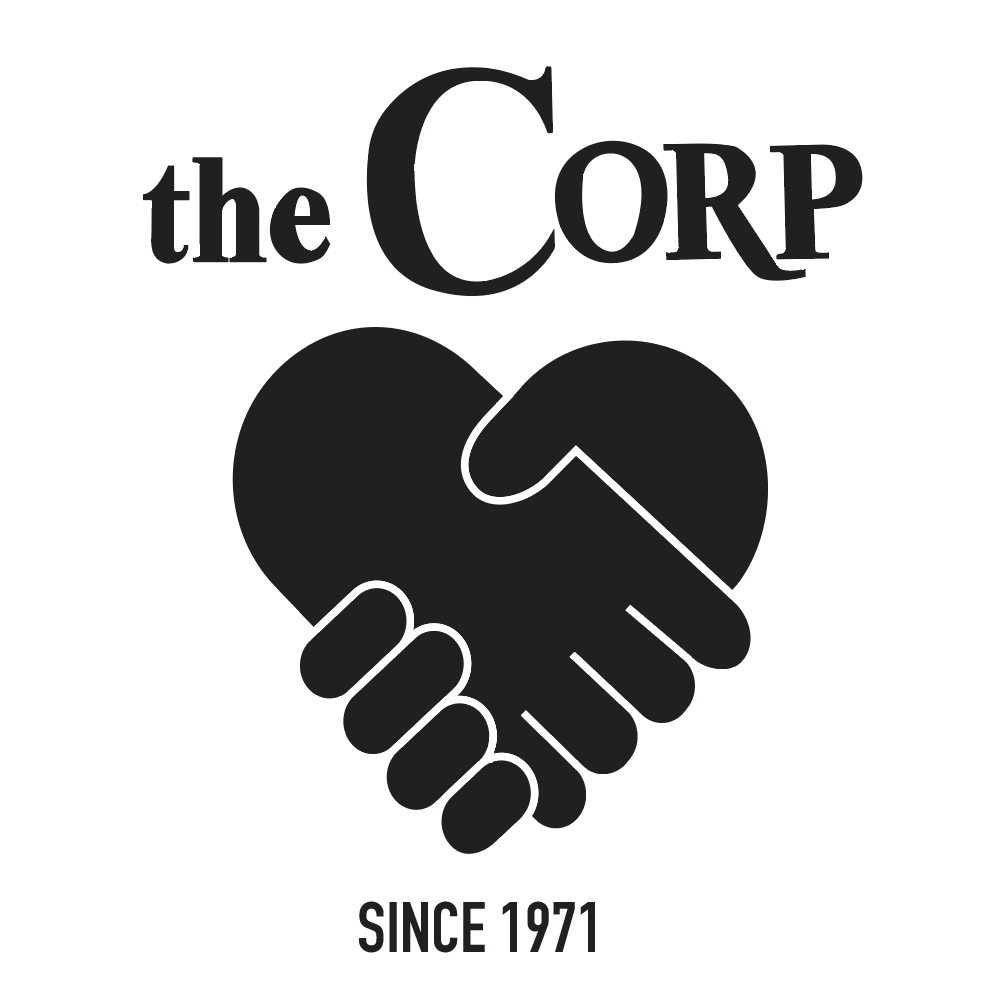
Type Study 14
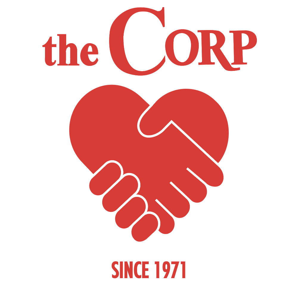
Monochrome Color Study 1
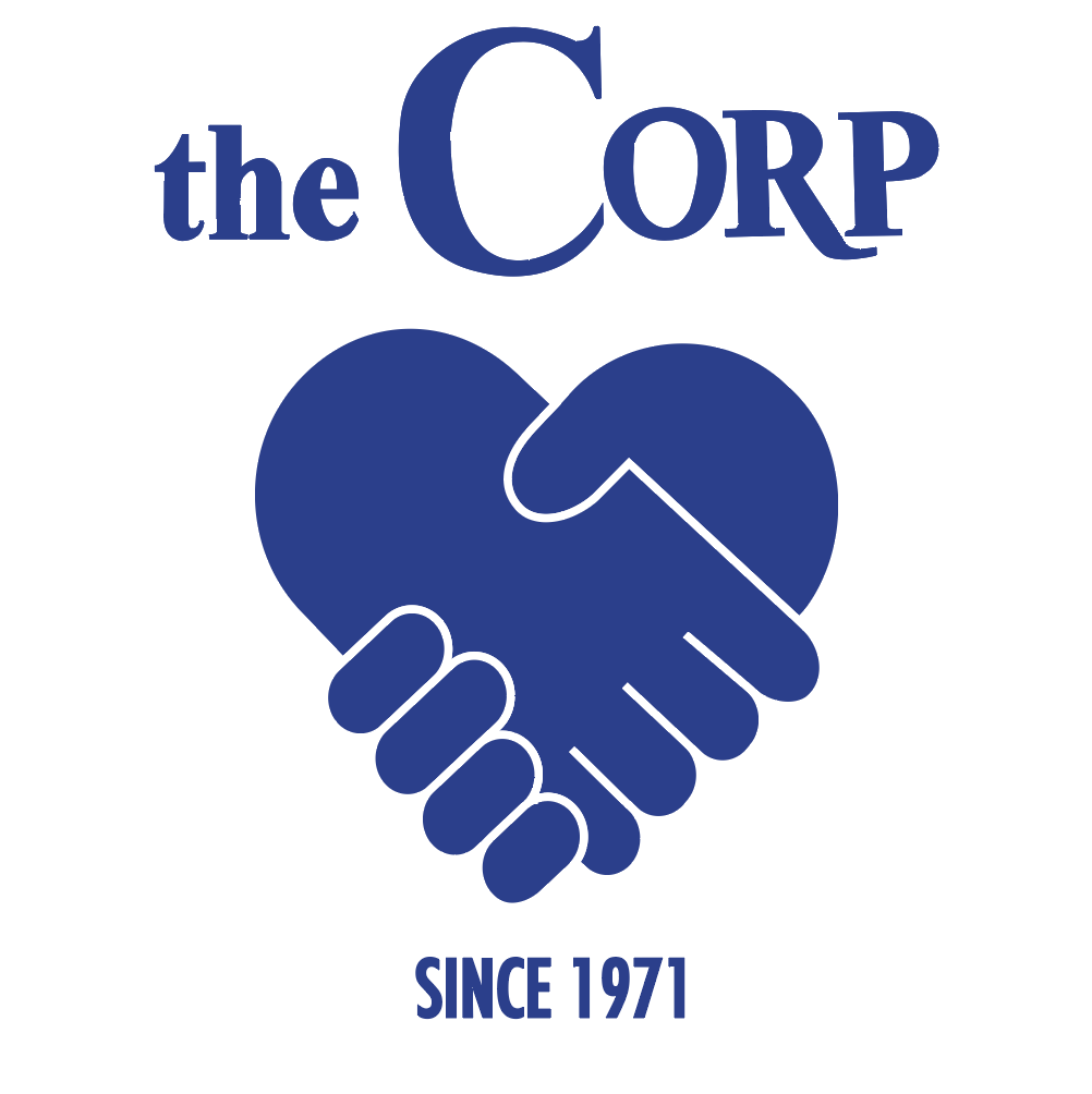
Monochrome Color Study 2

Monochrome Color Study 3
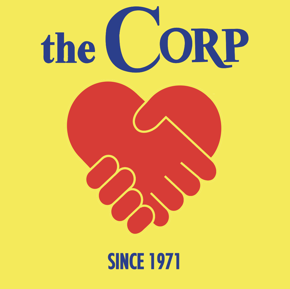
Primary Color Study 1
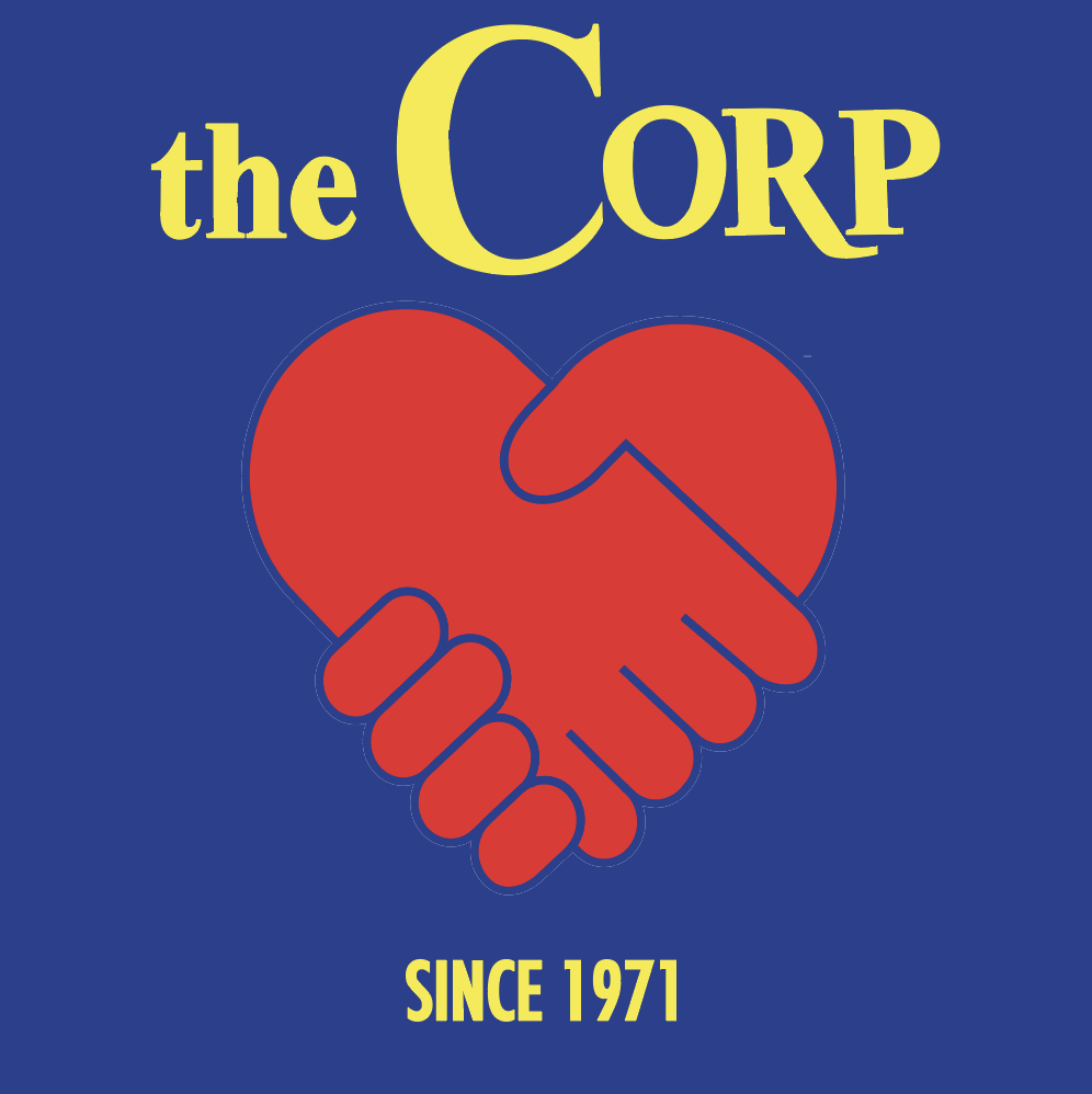
Primary Color Study 2
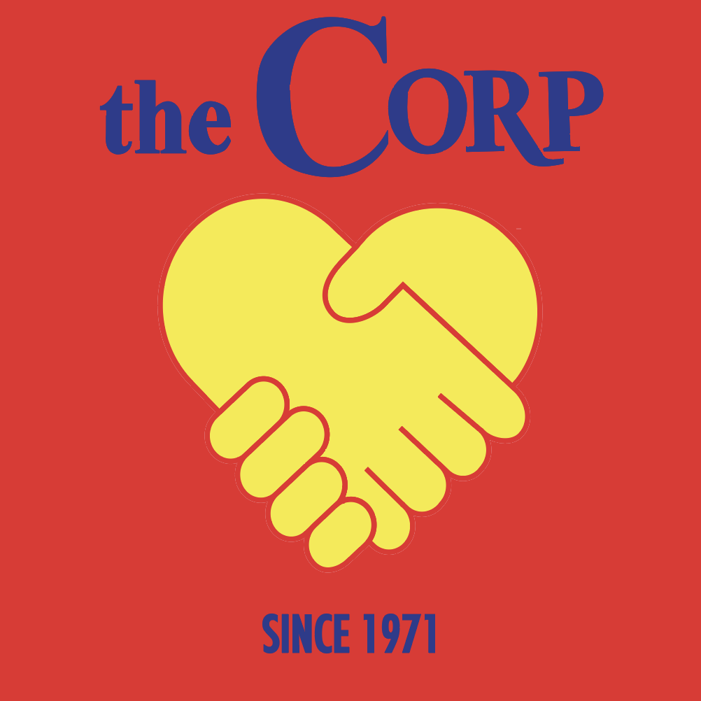
Primary Color Study 3
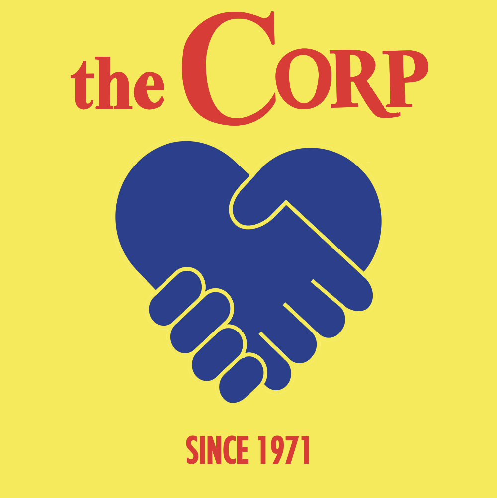
Primary Color Study 4
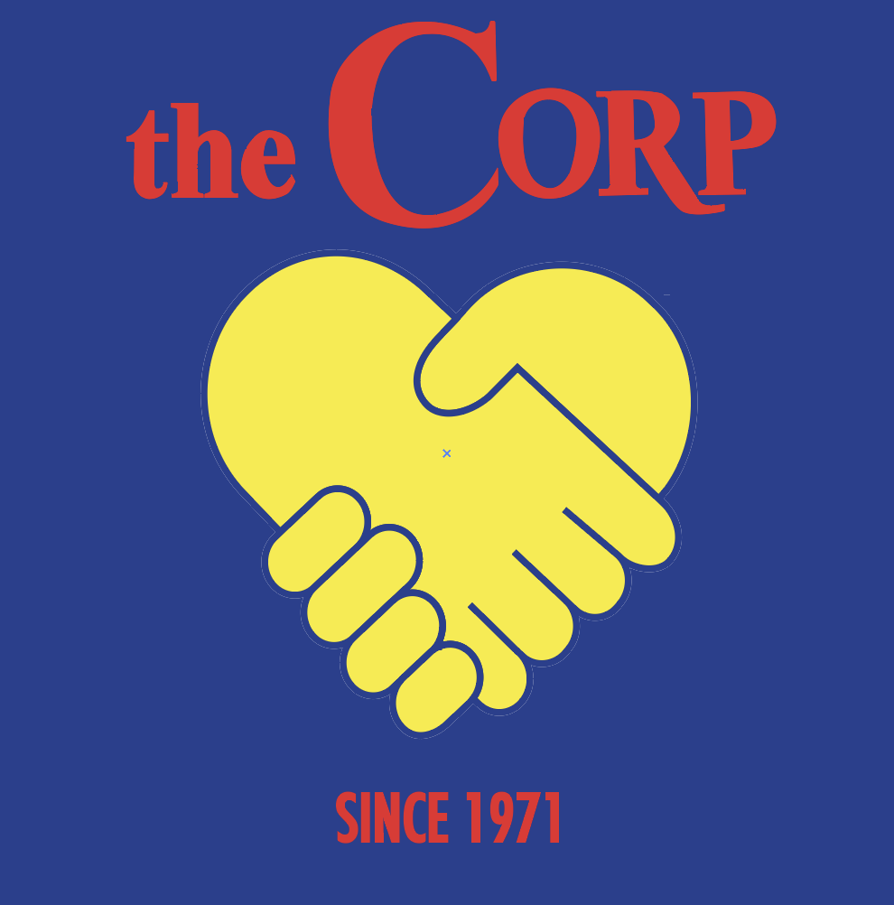
Primary Color Study 5
Primary Color Study 6

Analogous Color Study 1
Analogous Color Study 2
Analogous Color Study 3
Analogous Color Study 4
Analogous Color Study 5
Analogous Color Study 6
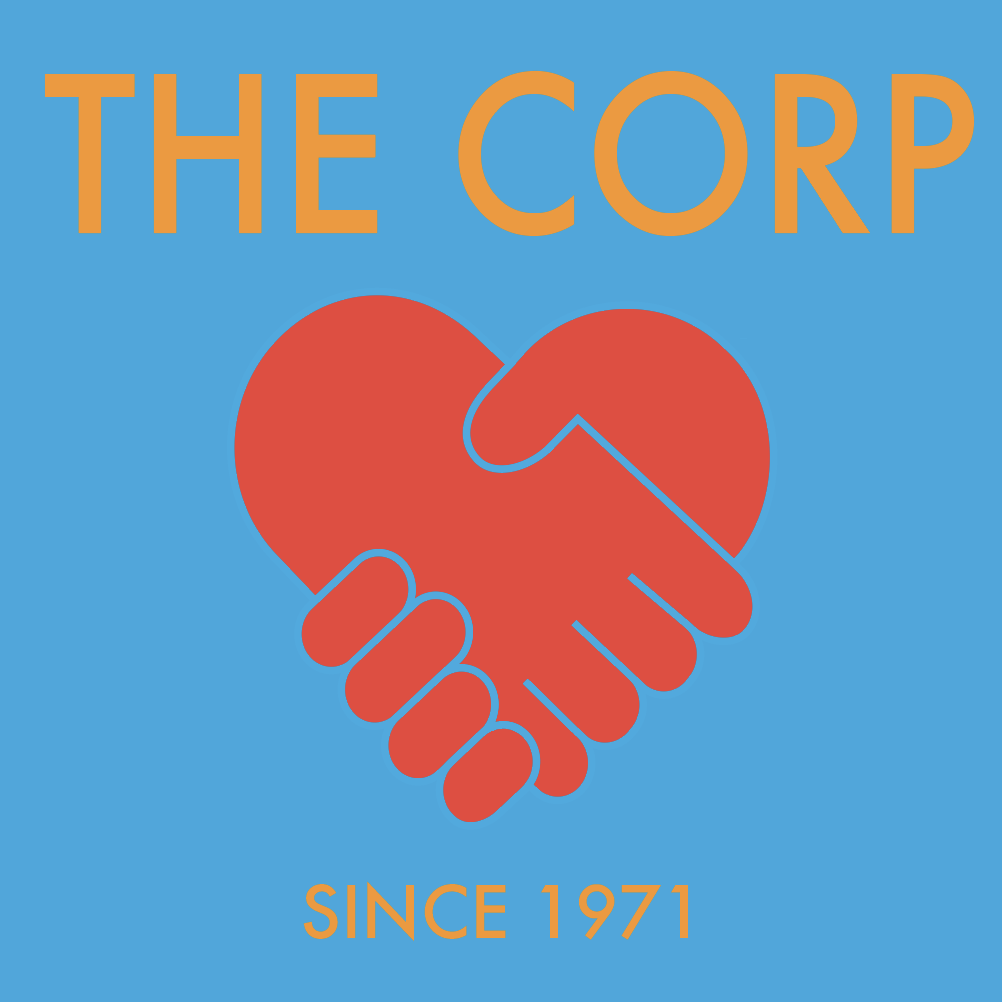
Complementary Color Study 1
Complementary Color Study 2
Complementary Color Study 3
Split Complimentary Color Study 1
Split Complimentary Color Study 2

Split Complimentary Color Study 3
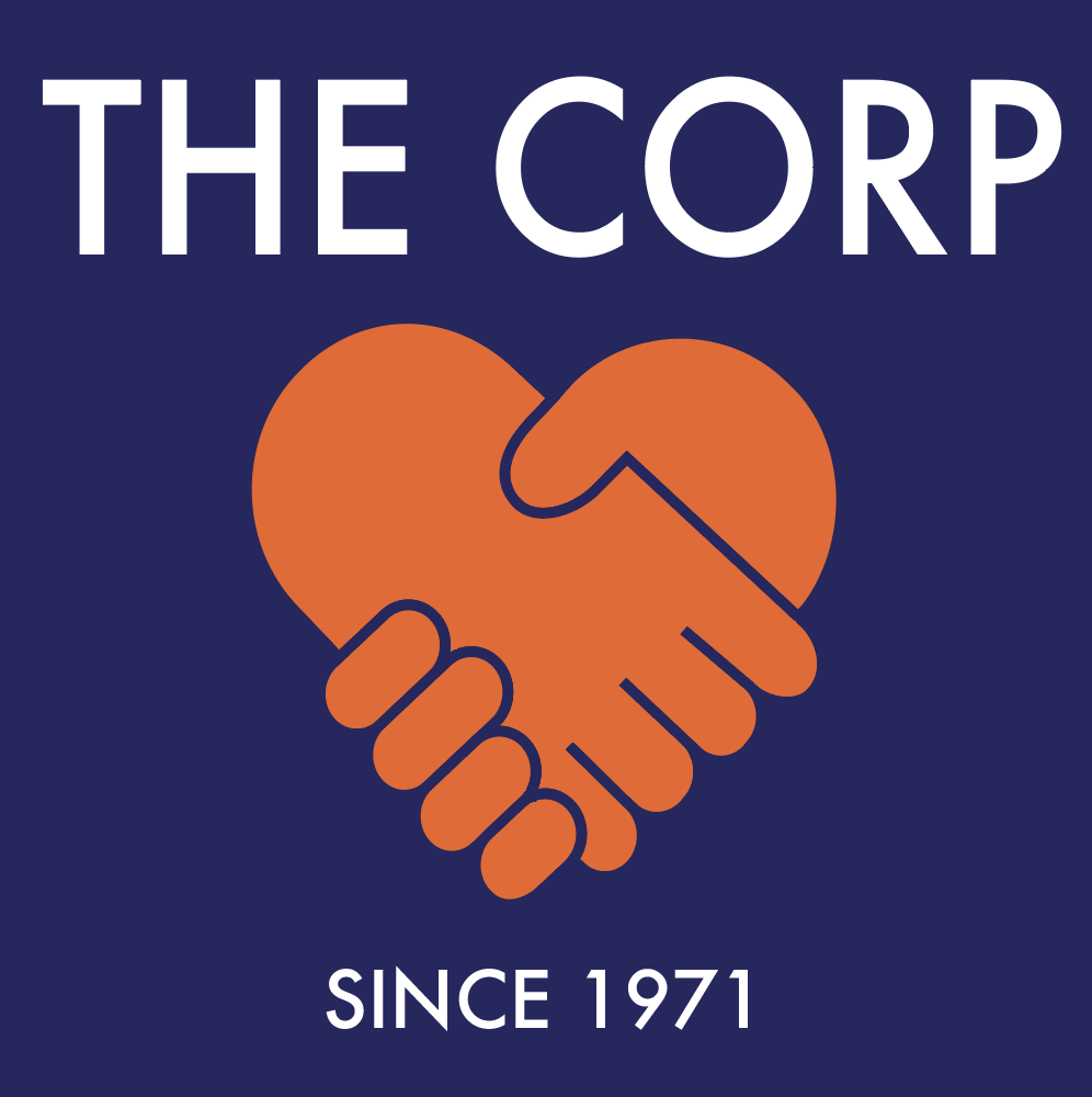
Refined Color Study 1
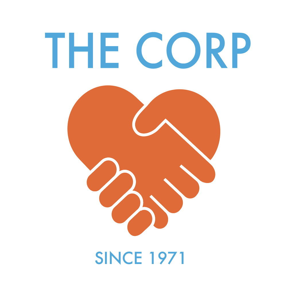
Refined Color Study 2
Refined Color Study 3
Refined Color Study 4
Refined Color Study 5
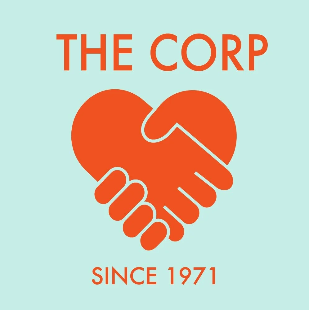
Final Logo
Business Cards
Redesigned business cards
Business Card Design Process


